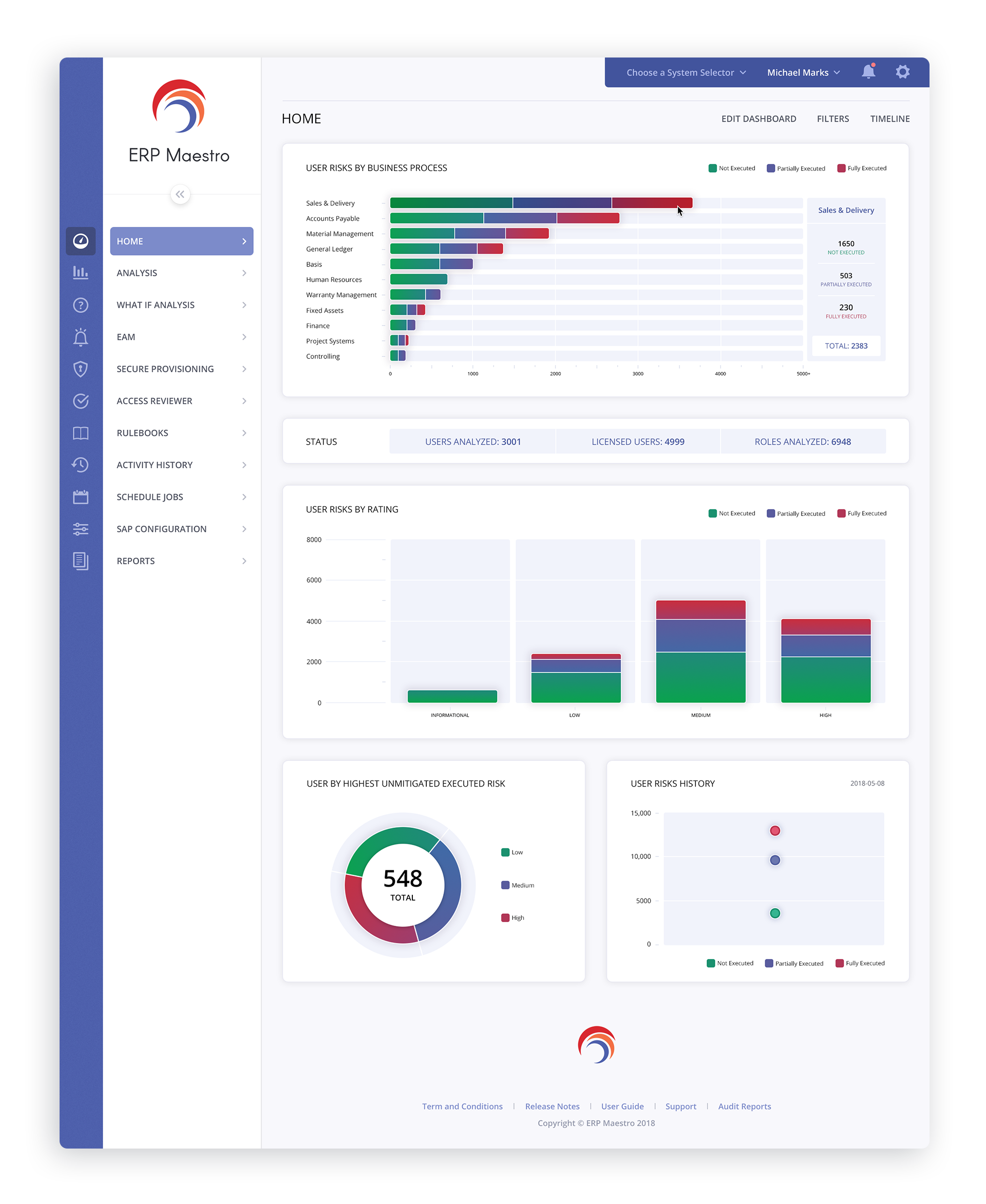
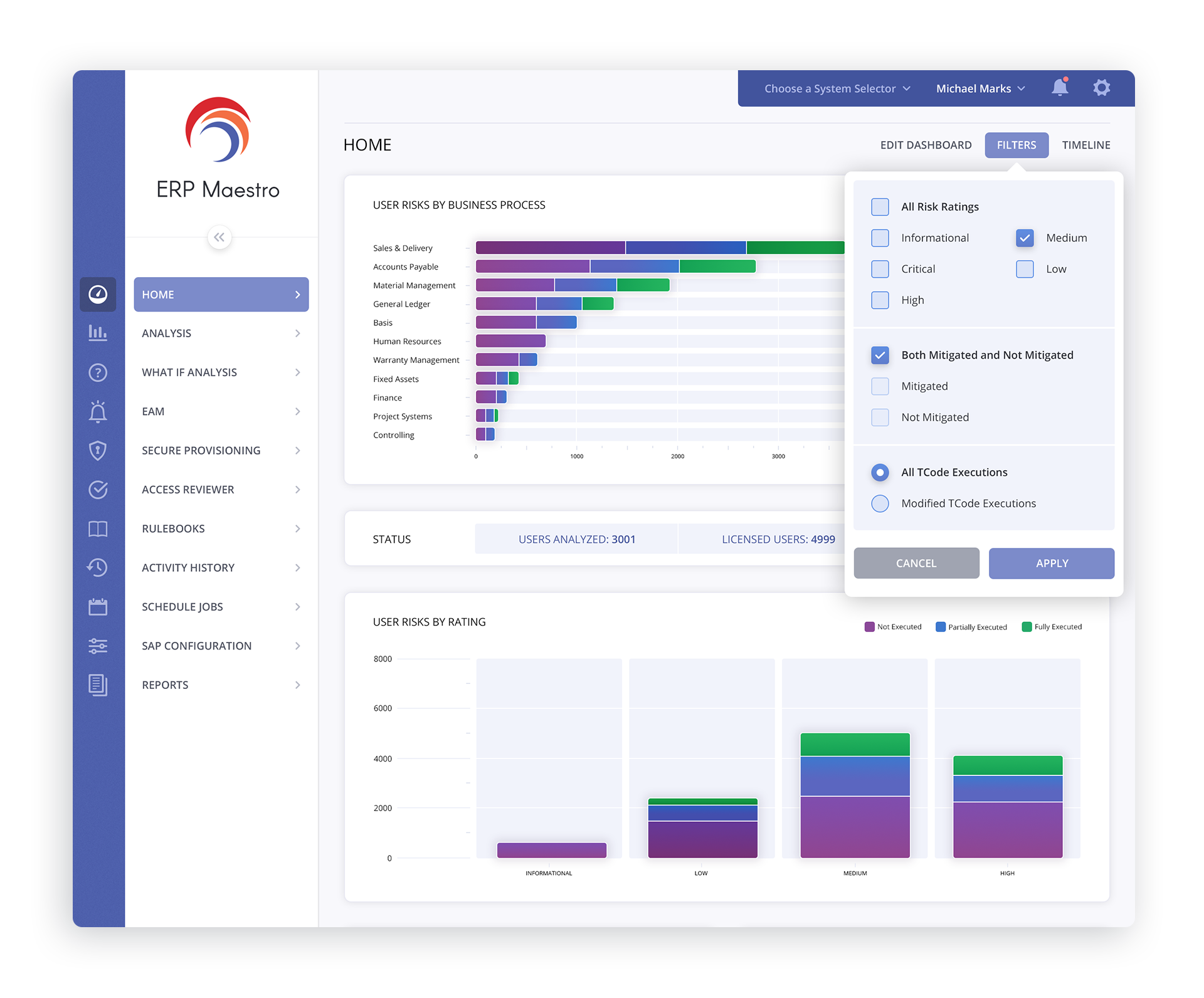
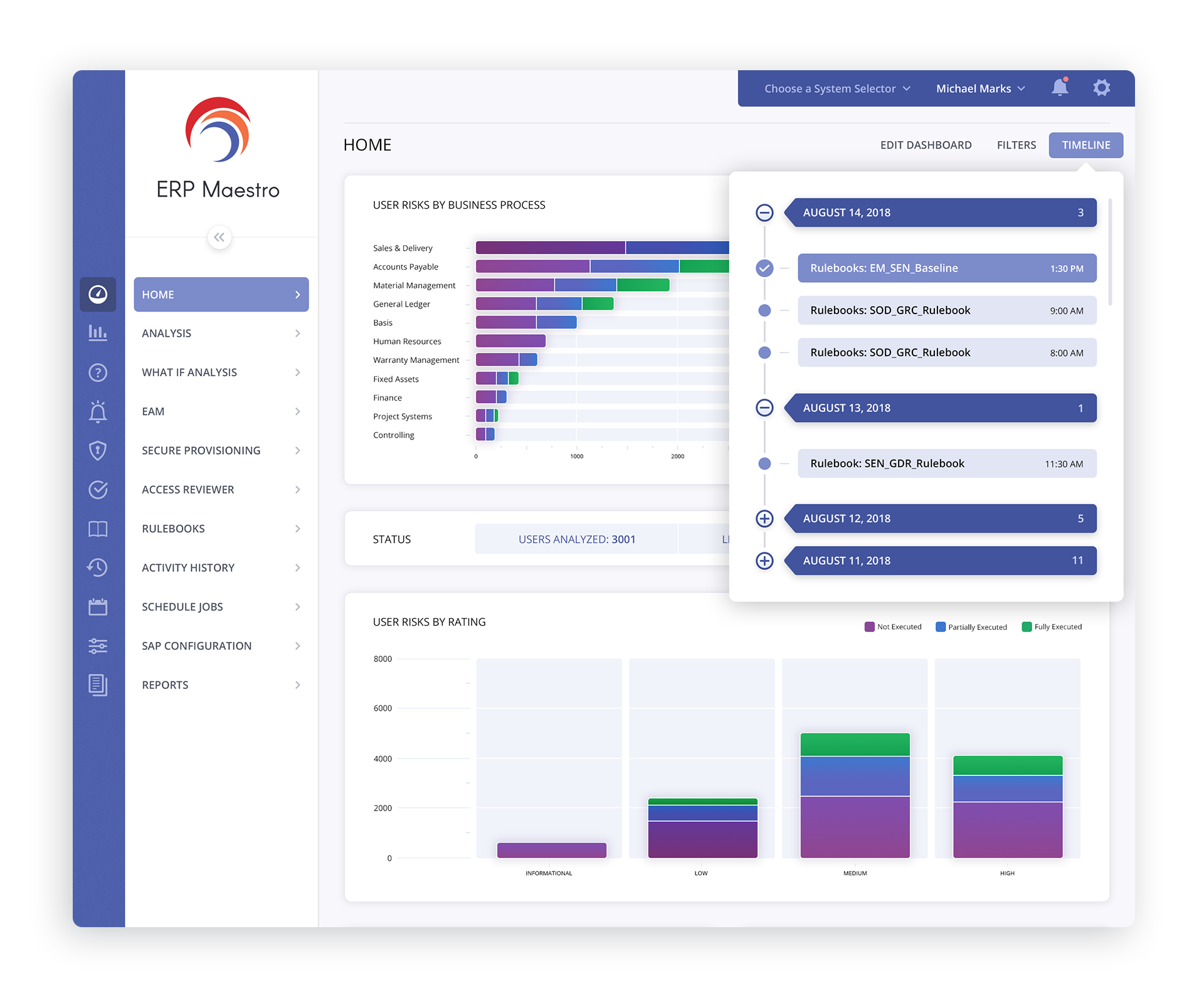
DASHBOARD
During the creative process, we provided ERP Maestro with 2-types of bar graphs - the one you see enlarged below, has the processes tallied in a sidebar when hovering over a specific row.
The other version has a popup display the same information where the mouse cursor resides.
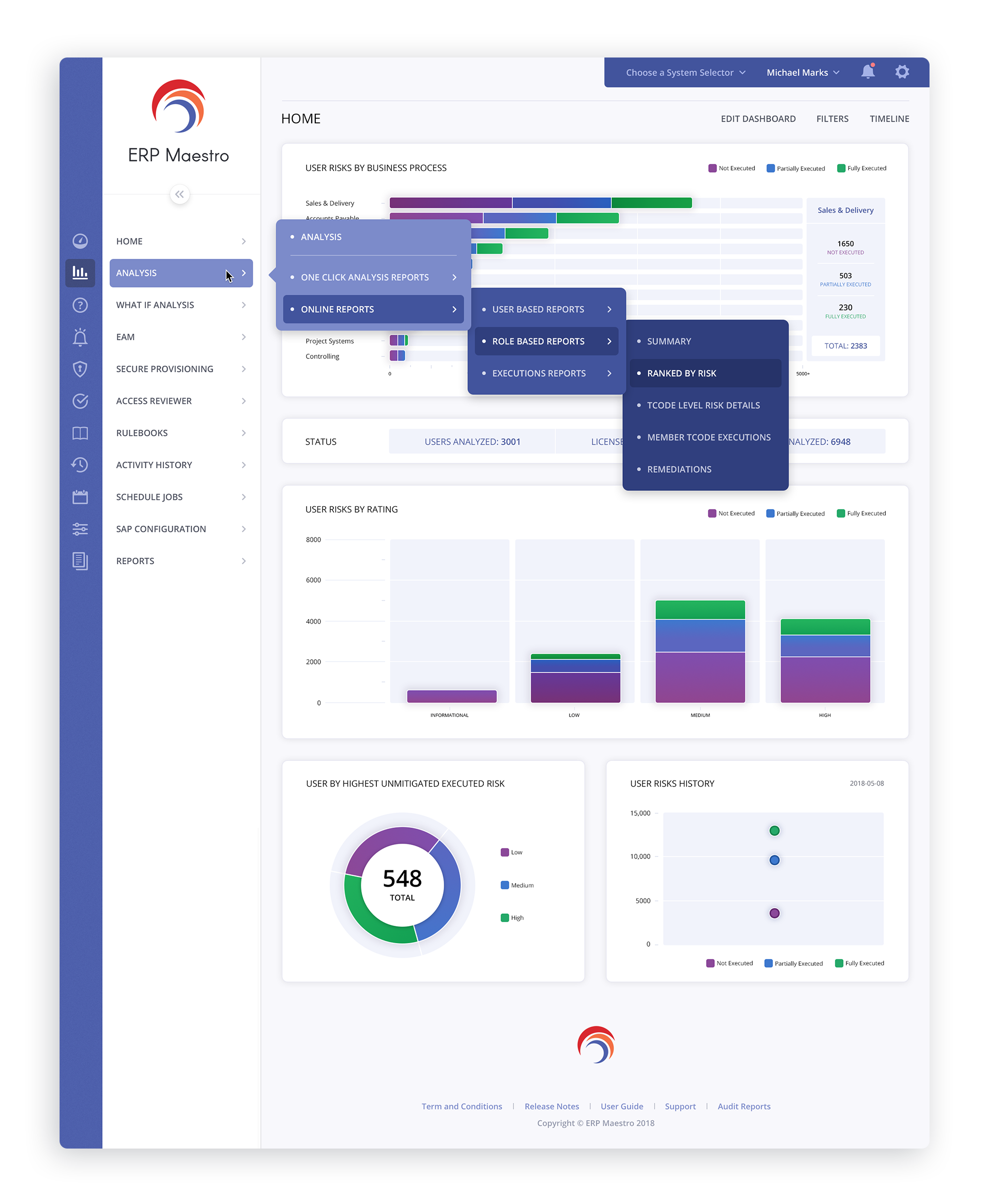
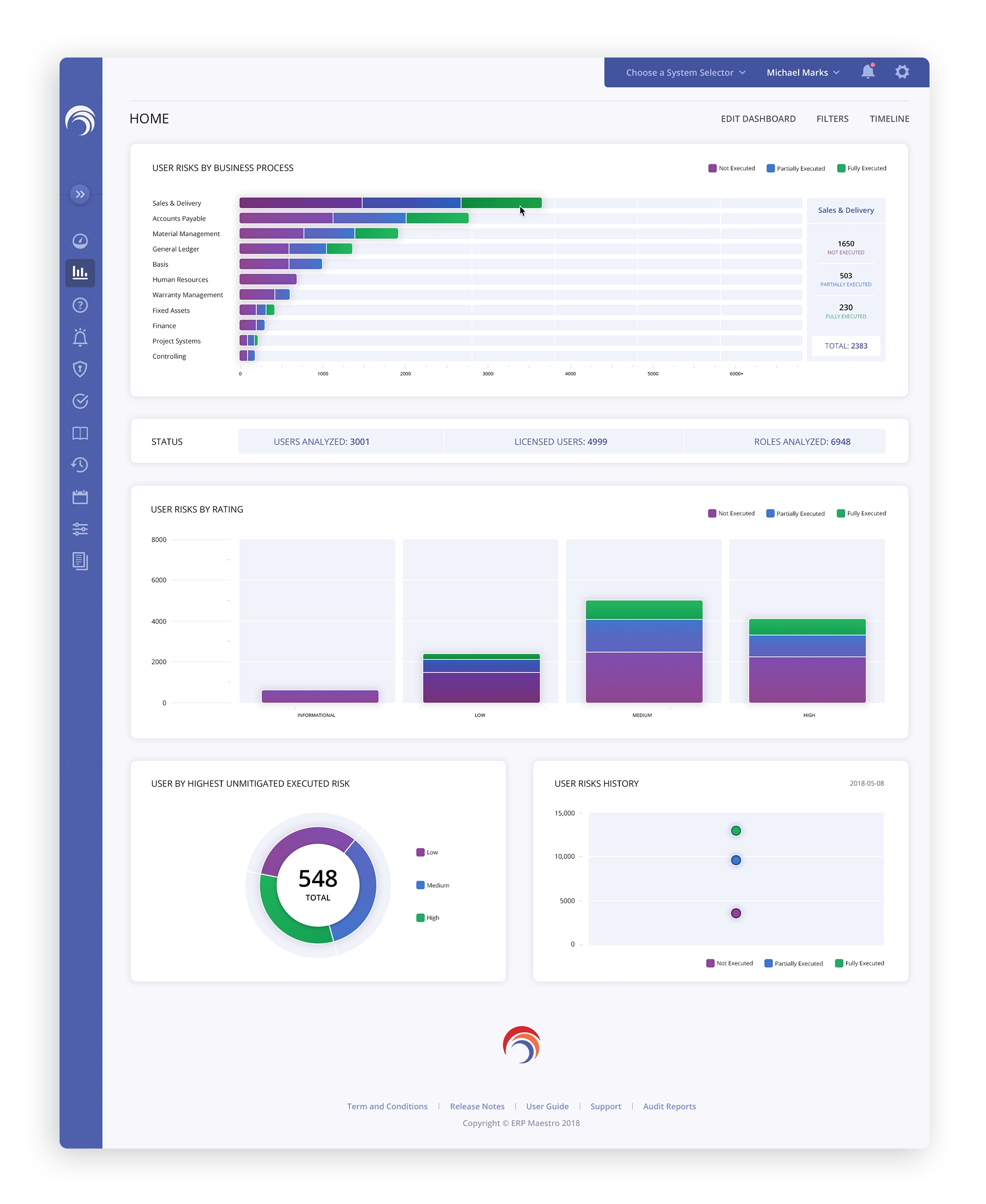
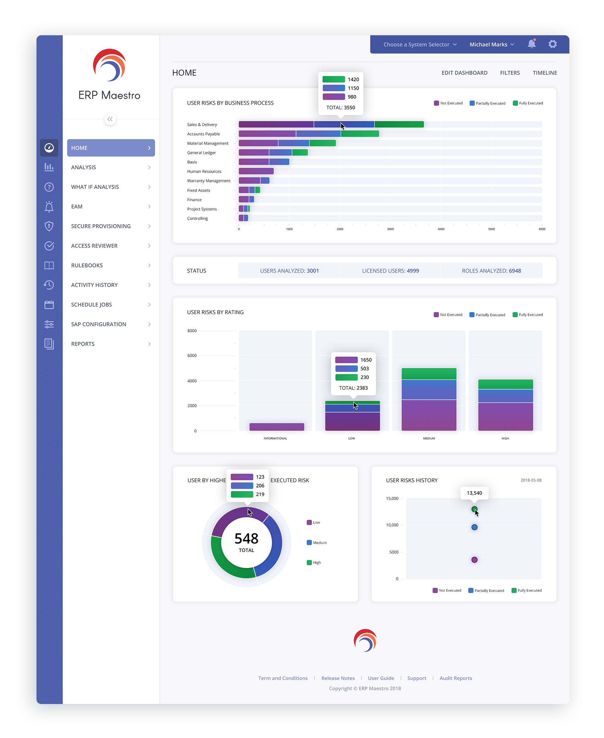
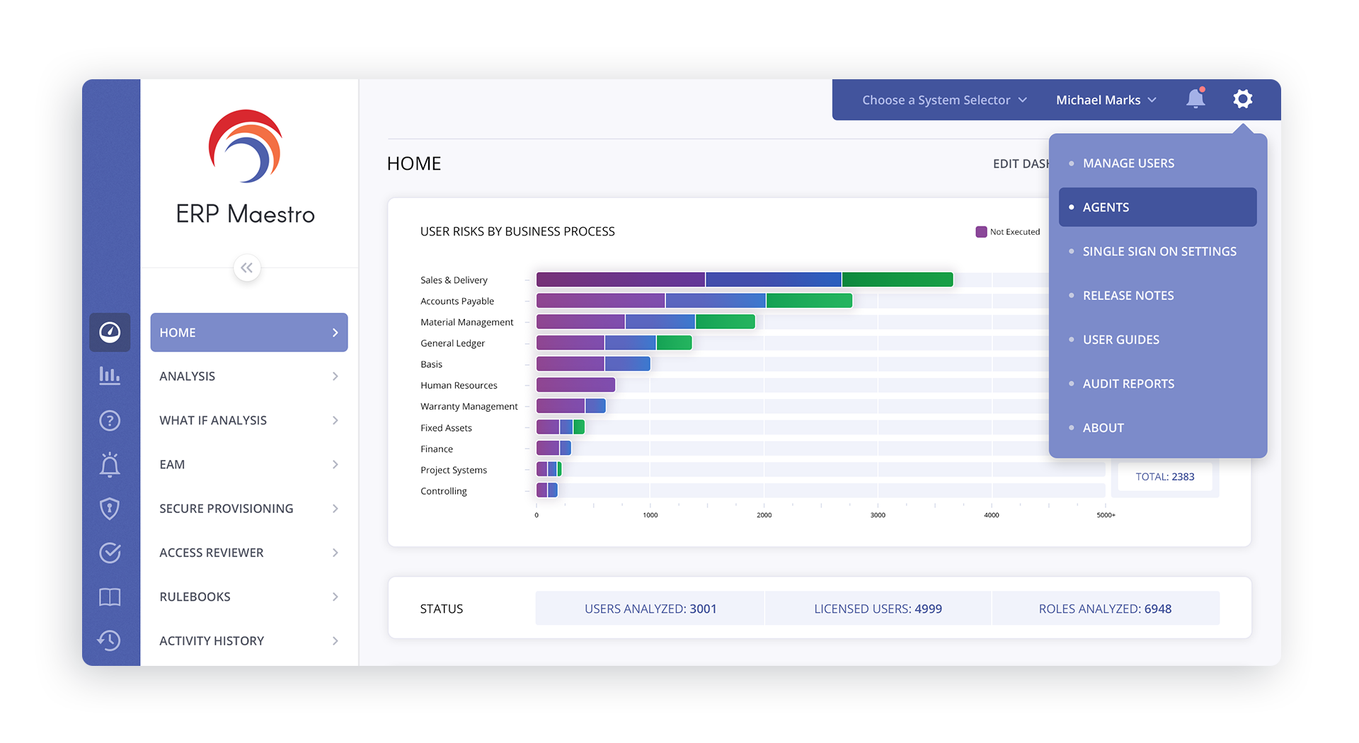
In the 1st image above, you can see the navigation menus cascade out, utilizing one of the core brand colors. This reinforces the brand identity, tying it in with the user interface.
The 2nd image shows the Main Navigation in its collapsed state, allowing the user to reclaim valuable screen real estate while still having access to the entire Navigation.
The 3rd image shows the alternate popup displaying values for the selected row.
The 2nd image shows the Main Navigation in its collapsed state, allowing the user to reclaim valuable screen real estate while still having access to the entire Navigation.
The 3rd image shows the alternate popup displaying values for the selected row.
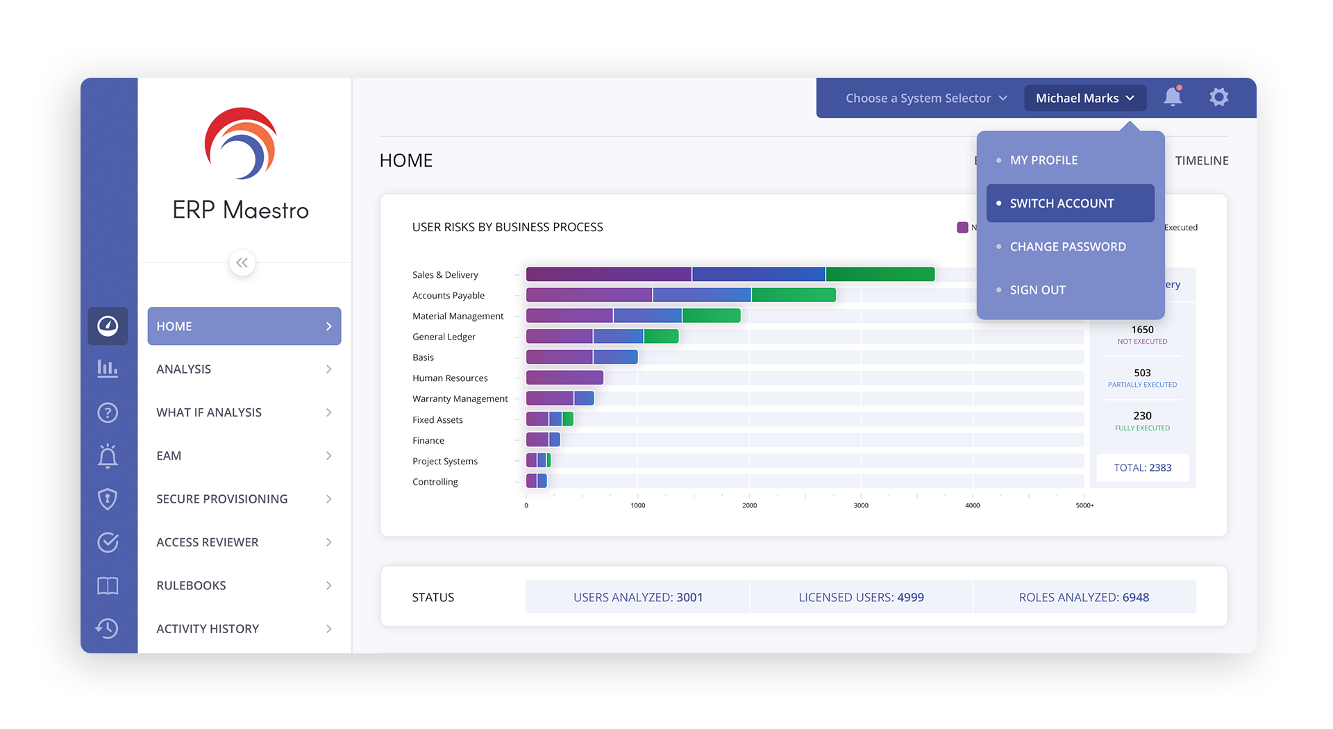
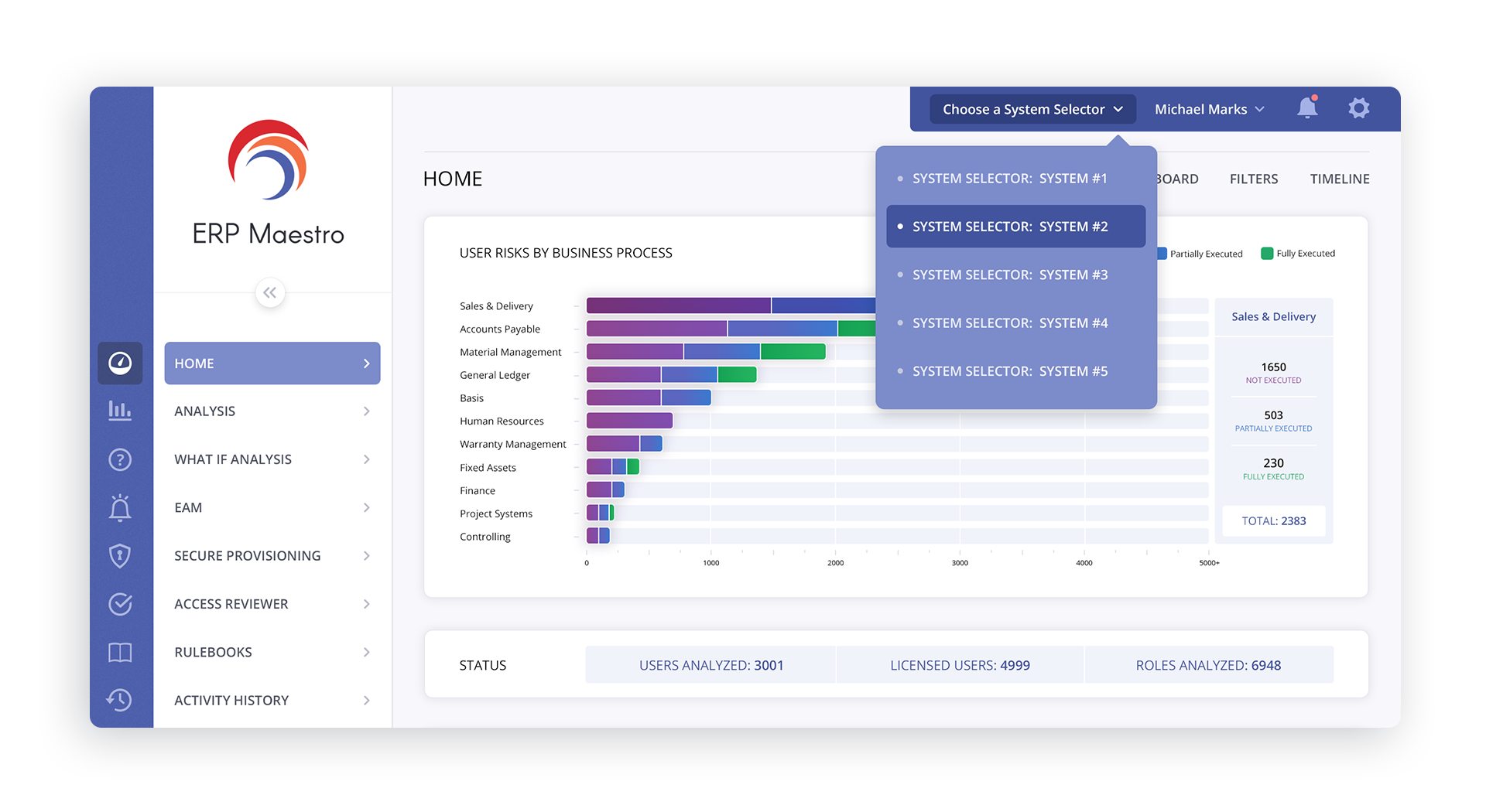
DASHBOARD MAIN MENUS

DASHBOARD CHROME MENUS

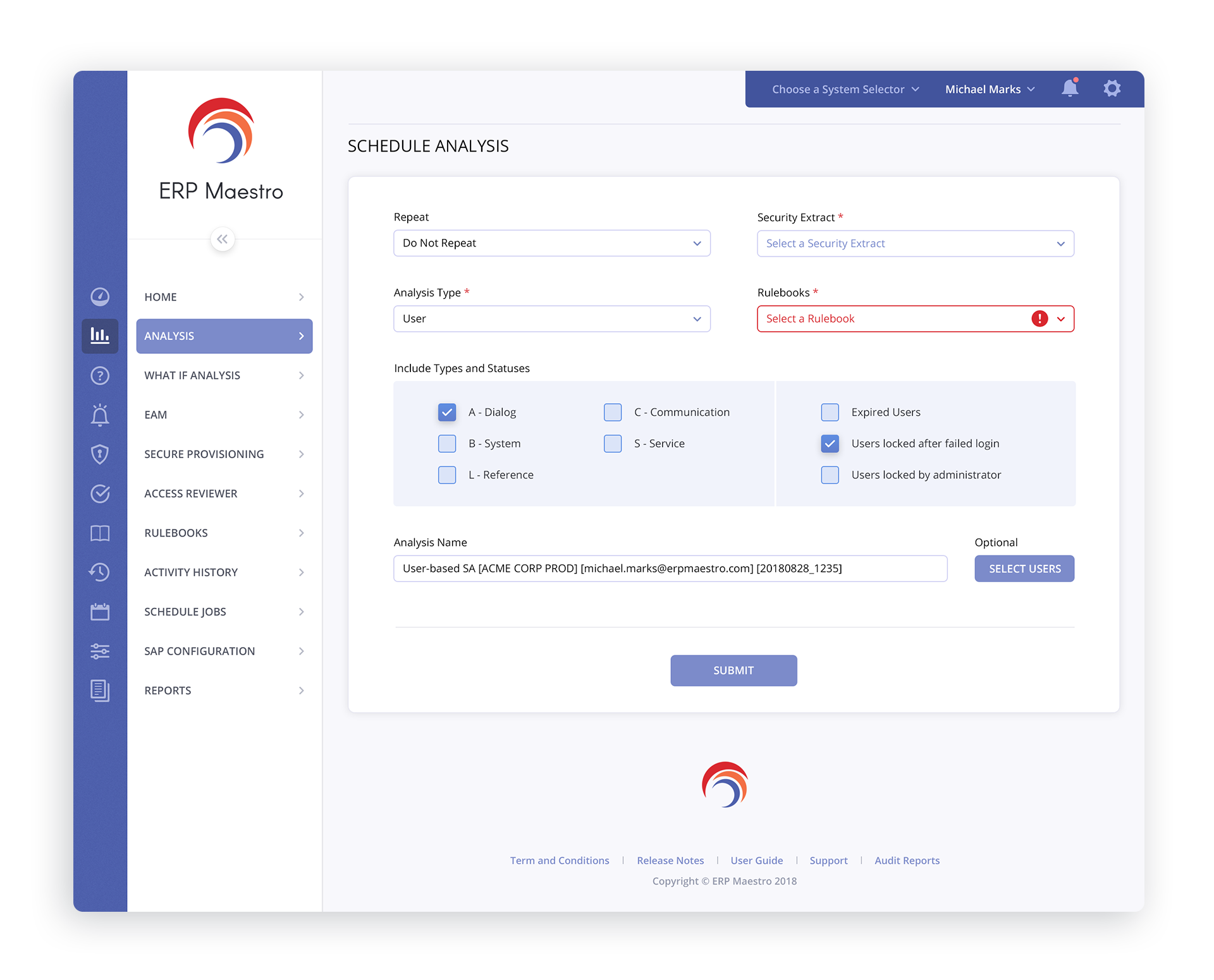
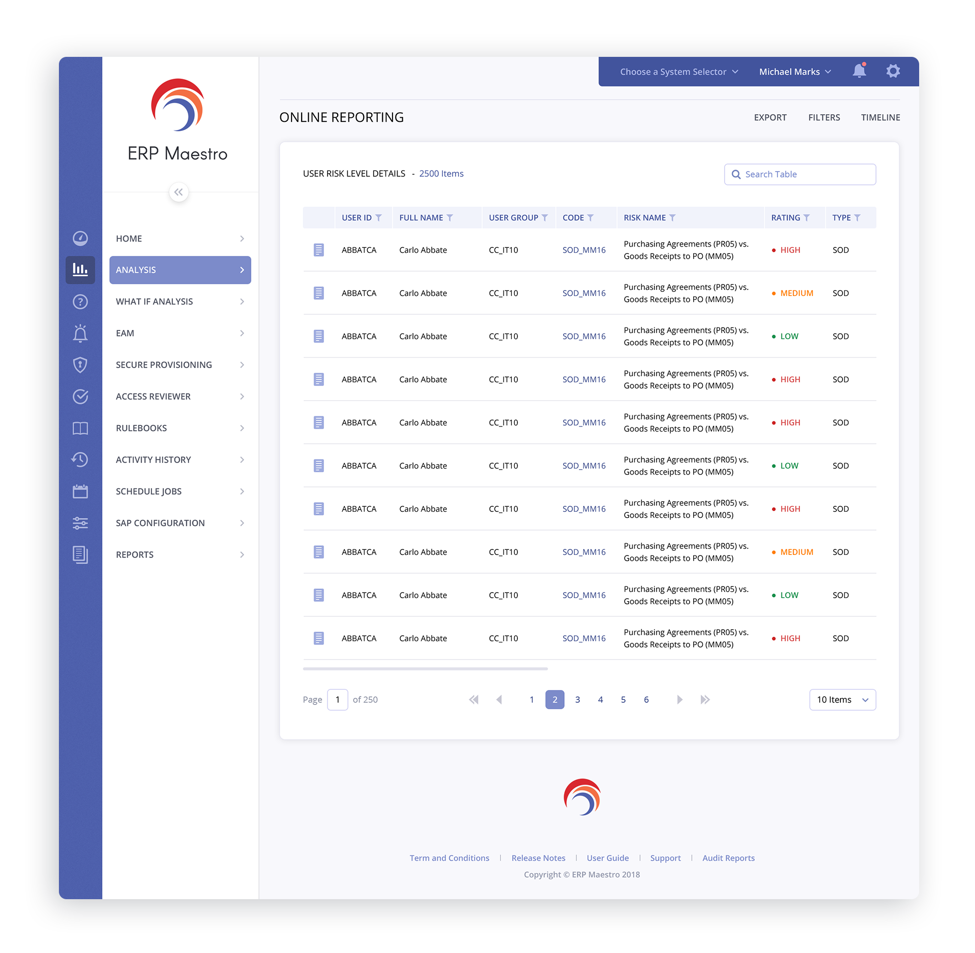
SCHEDULE ANALYSIS + ONLINE REPORTING

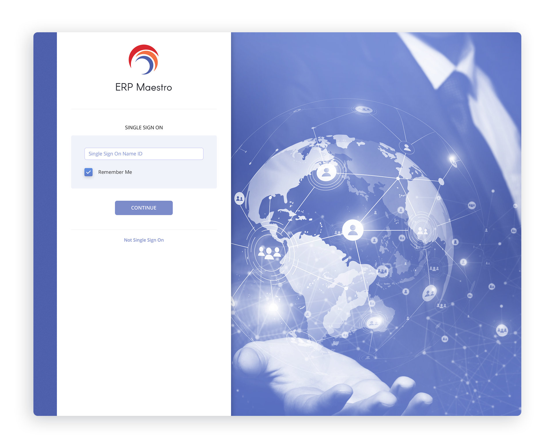
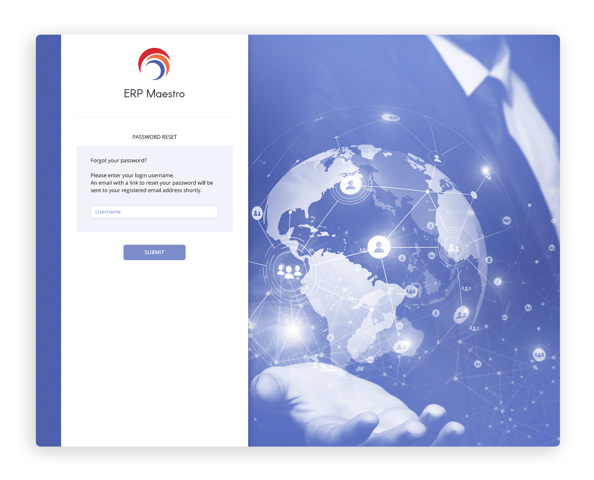
LOGIN

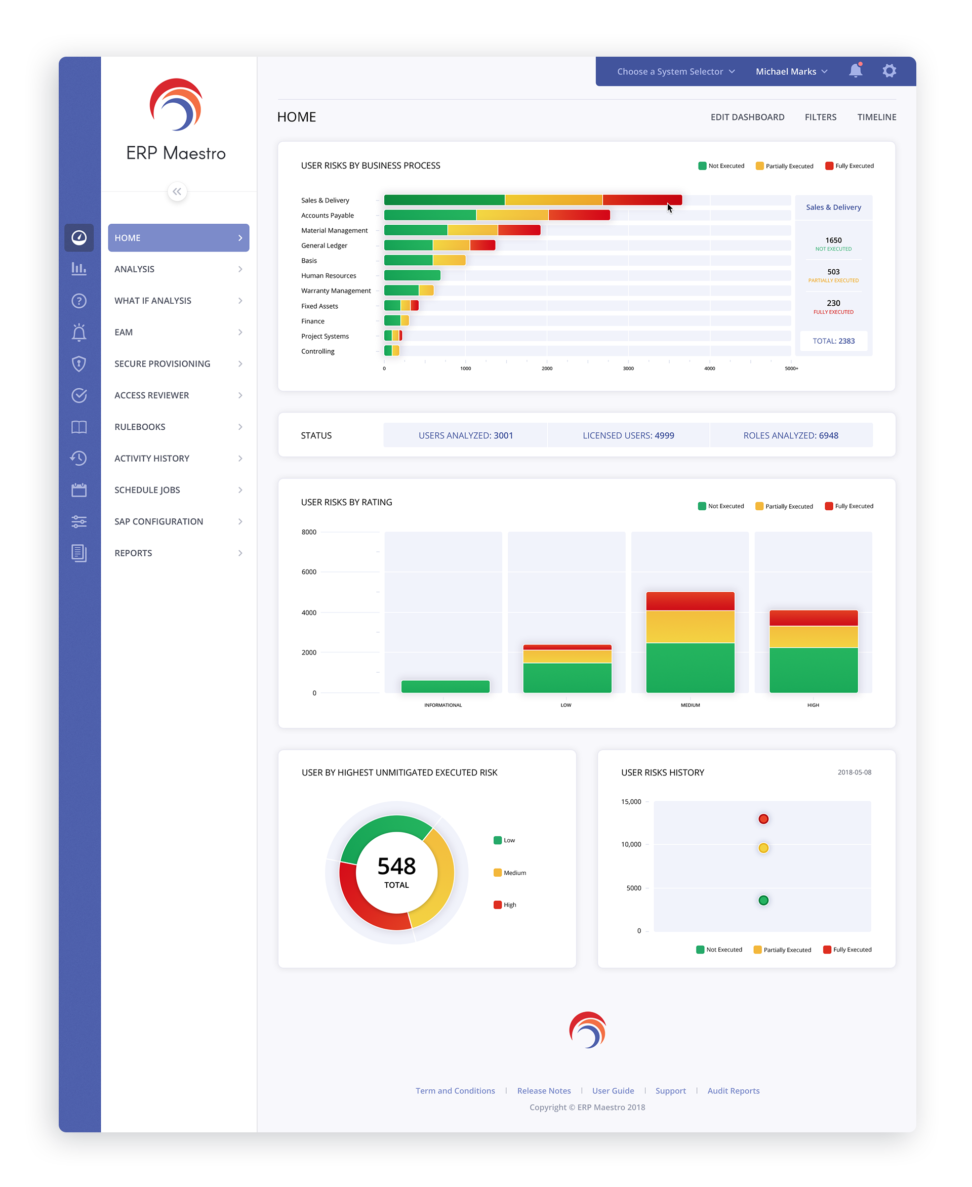
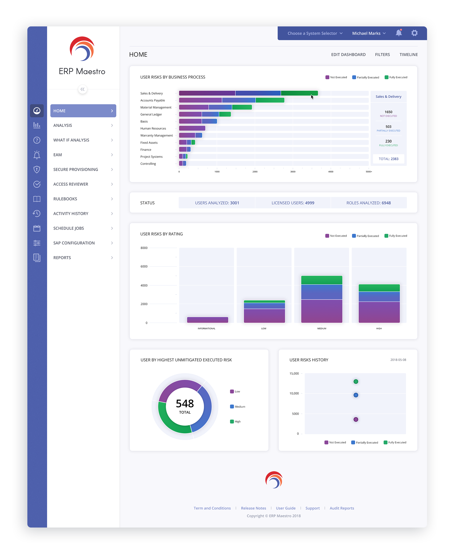
DASHBOARD ALTERNATE COLOR THEMES