Establishing the Color Palette
From the start, we decided to bring in a saturated, color gradient palette for the design language while striking a sharp contrast with deep black. A large, majority of healthcare apps look somewhat pedestrian. Since the modern design trends lean toward vibrant, color gradients, this was a sound design foundation to work off of. So we created the base color palette shown below.
From the start, we decided to bring in a saturated, color gradient palette for the design language while striking a sharp contrast with deep black. A large, majority of healthcare apps look somewhat pedestrian. Since the modern design trends lean toward vibrant, color gradients, this was a sound design foundation to work off of. So we created the base color palette shown below.
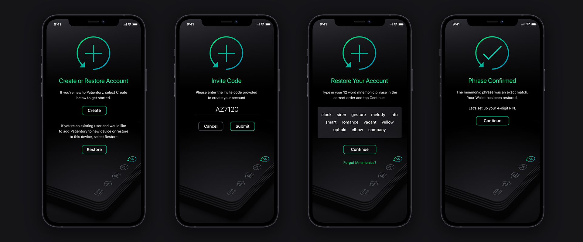
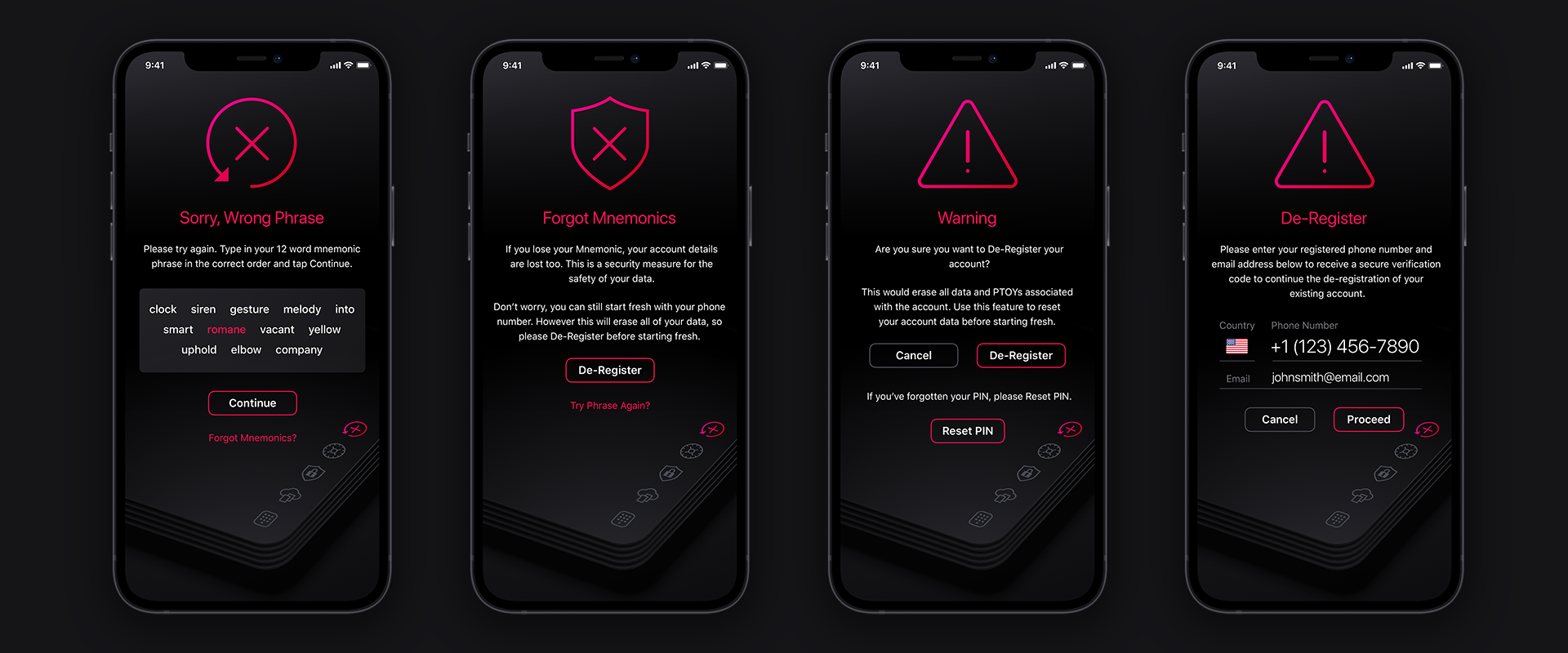
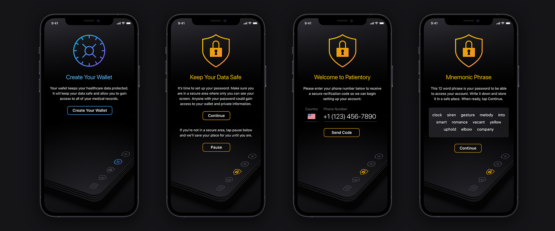
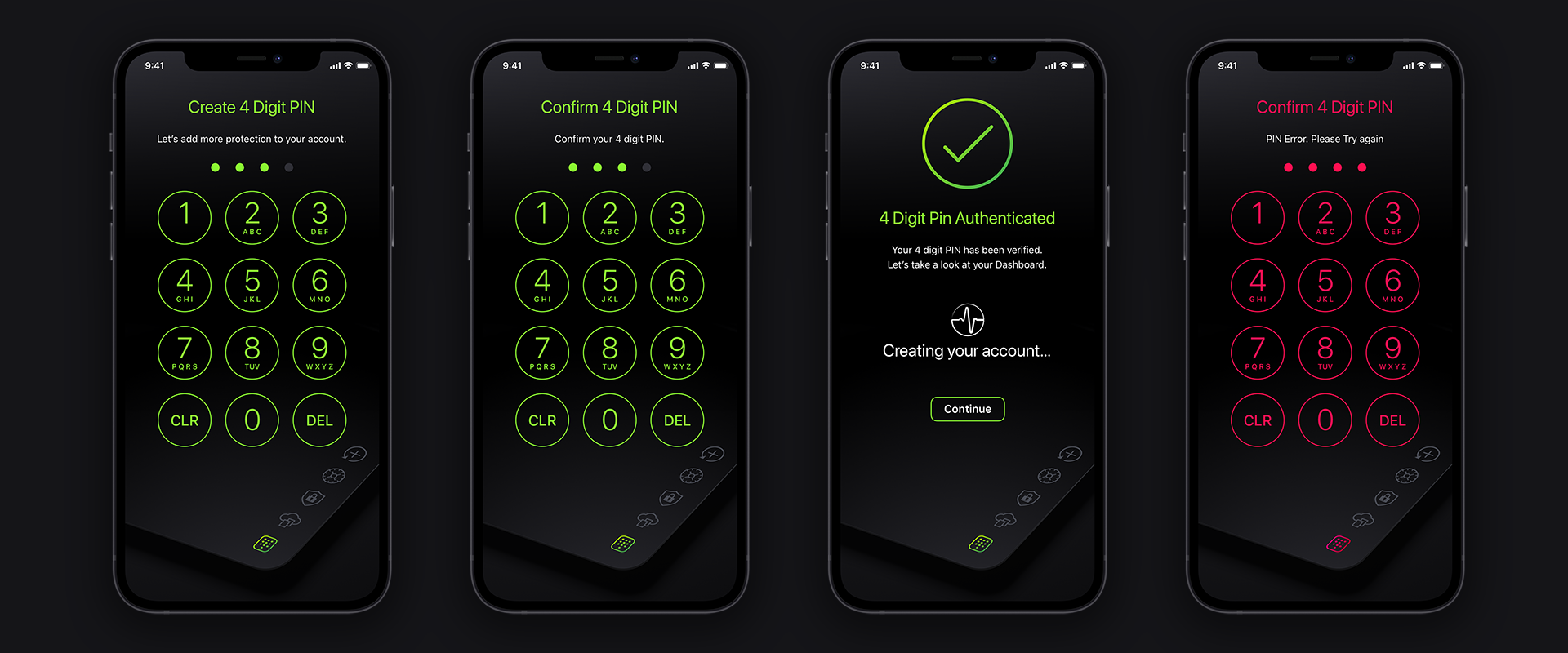
Intro Screen + Onboarding Setup
Featuring an intro loading animation transitioning to Terms of Service which then transitions by animation to the 5 main setup screens.
Featuring an intro loading animation transitioning to Terms of Service which then transitions by animation to the 5 main setup screens.
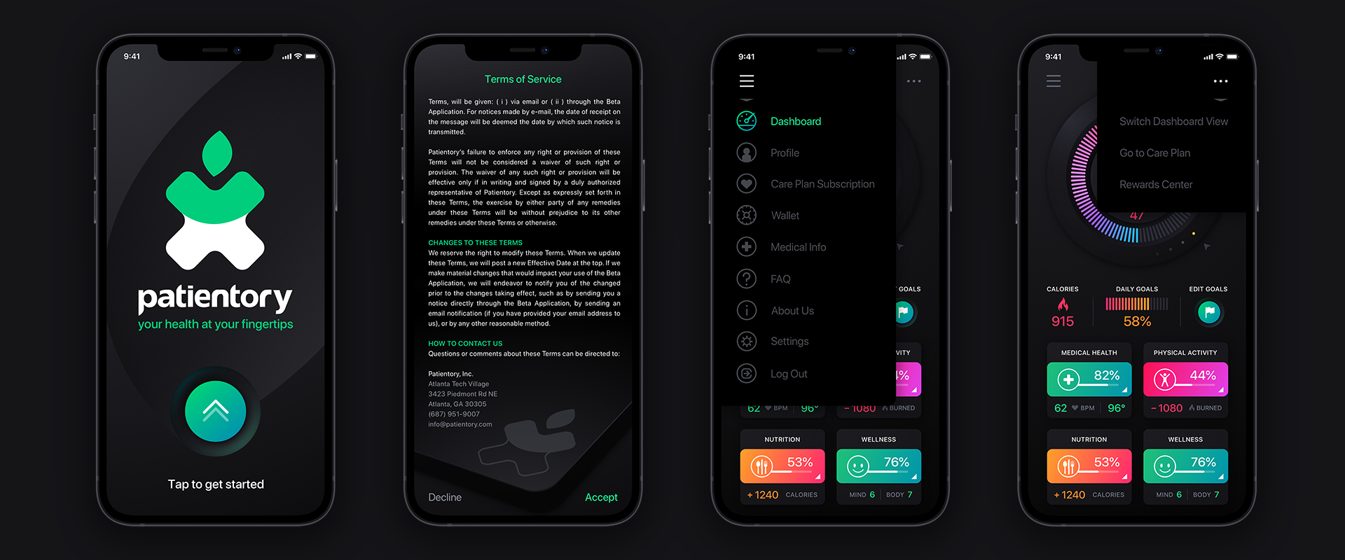
Onboarding Screens

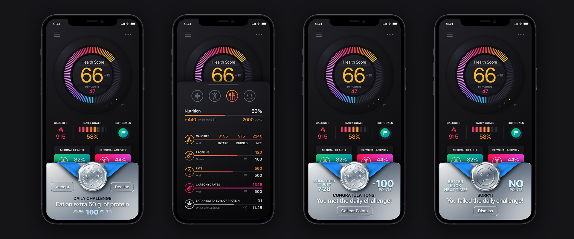
Dashboard
The Dashboard is designed using a neuomorphic jog wheel that the user can drag & turn to cycle through previous health scores. The colors pop off the dark backgrounds and signify various stages in a user’s progress. We deployed both a grid and a list view layout for the categories.
The Dashboard is designed using a neuomorphic jog wheel that the user can drag & turn to cycle through previous health scores. The colors pop off the dark backgrounds and signify various stages in a user’s progress. We deployed both a grid and a list view layout for the categories.
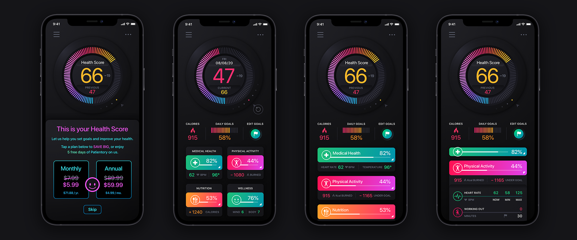
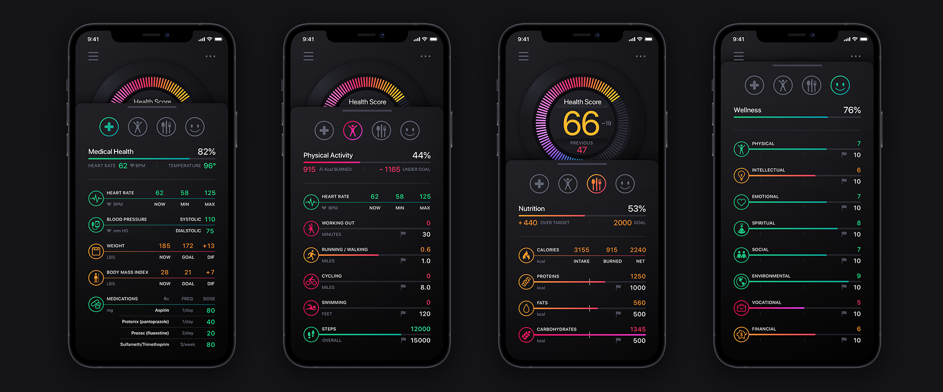
Shown Below: The Dashboard Grid View stats. For the List View, the category simply releases the states panel below the category.
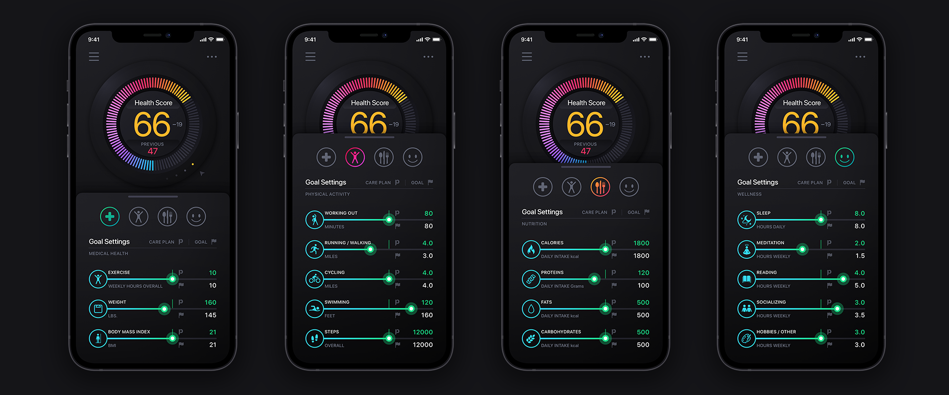
Tapping the Edit Goals icon on the main Dashboard transports the user into these panels. It’s good to have goals!
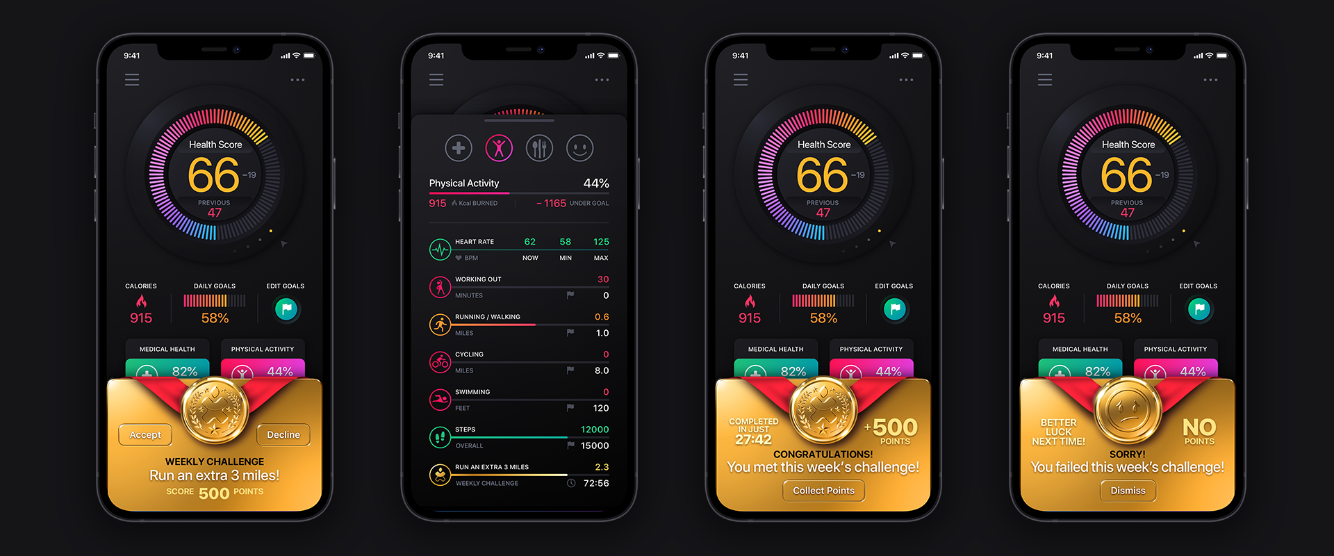
Daily + Weekly Challenges
Delivering a game-like experience to Patientory was important to our design team. The more endearing the app is, the more likely users will not “drop off” from their health goals. This is where the skeuomorphic design elements come into play. Users are given both Daily and Weekly Challenges to overcome. If they complete a challenge, they’re greeted by the animation, if they fail, then it’s a static image with a sad face and encouragement to do better next time.
Delivering a game-like experience to Patientory was important to our design team. The more endearing the app is, the more likely users will not “drop off” from their health goals. This is where the skeuomorphic design elements come into play. Users are given both Daily and Weekly Challenges to overcome. If they complete a challenge, they’re greeted by the animation, if they fail, then it’s a static image with a sad face and encouragement to do better next time.
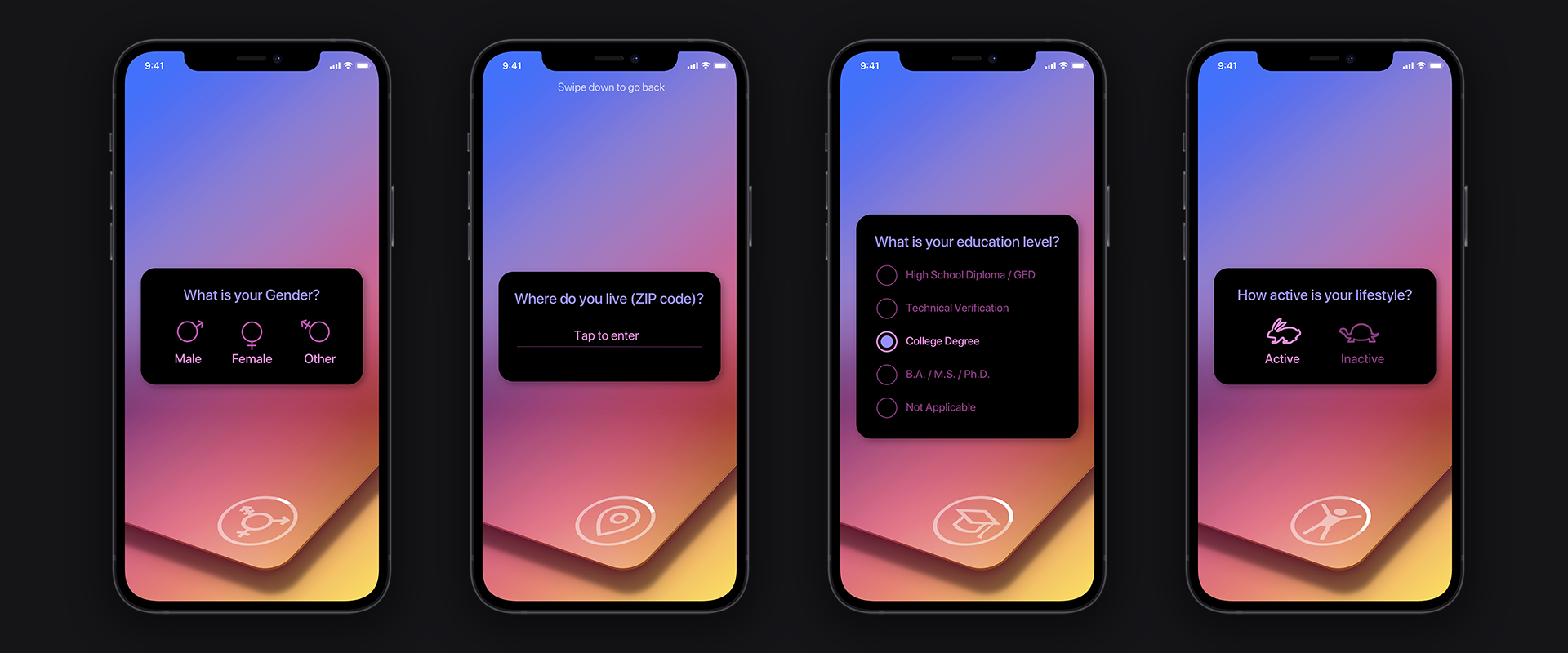
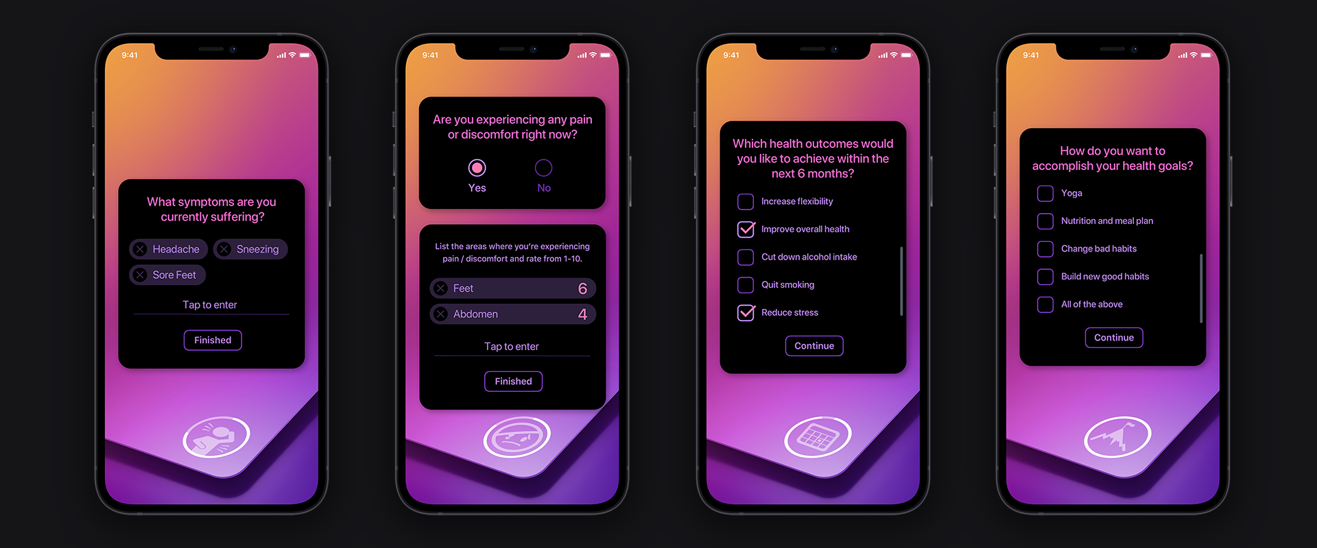
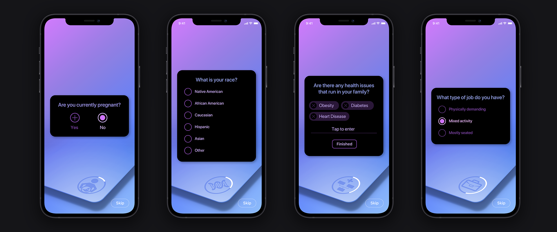
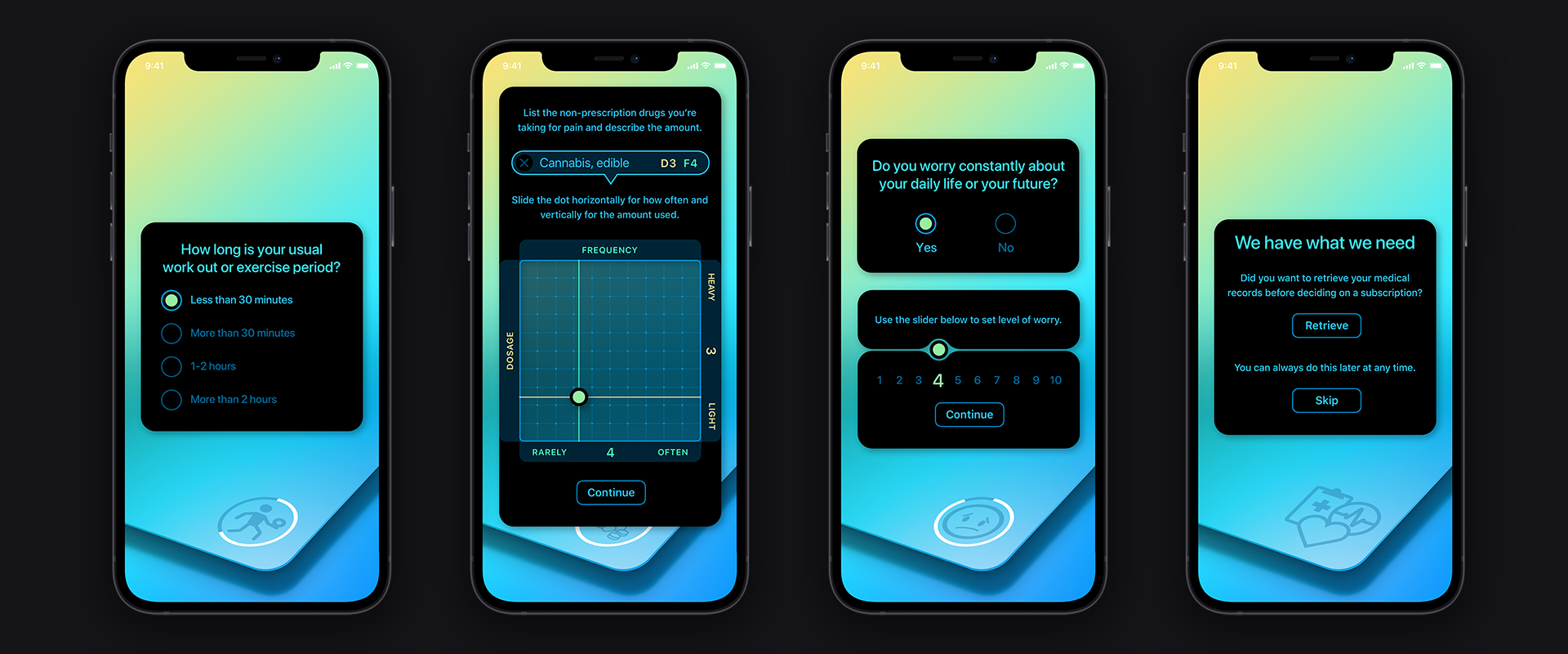
The Onboarding Questionaire
Prior to getting to the questionnaire, the user had to go through the initial Onboarding panels to setup their account, digital wallet, and security via mnemonic phrases. So it was paramount to our design team, to alleviate the fatigue that would eventually come during the questionnaire. There are 20 mandatory questions + 5 optional questions. That’s 25 questions right from the start, before you even get to the main Dashboard.
In order for Patientory to deliver the user’s Health Score and Health Plan, they must ask the user these questions. To mitigate users from abandoning the application out of frustration, we instituted 3 methods to keep them interested & show their progression.
In order for Patientory to deliver the user’s Health Score and Health Plan, they must ask the user these questions. To mitigate users from abandoning the application out of frustration, we instituted 3 methods to keep them interested & show their progression.
1. Every 5 questions we changed the color theme. This gives the user a sense of progression as the design language is constantly changing. We chose gradients that mimicked sunrise & sunsets, ocean water, and calming color themes.
2. The ring around the icon on each question, is actually a progress bar, so the user has a visual representation of their progression.
3. We removed the need to tap a Next button for all mandatory questions. The moment a user makes a selection the panel advances to the next question. This cuts down on mental & finger fatigue and gives the user a sense of forward momentum. A user can always swipe the panel down, to go back and re-answer a previously question. On the Optional questions we provided a SKIP icon.
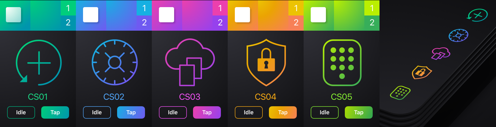
To keep things simple to view, we’ve just included 4 screens from each series intermixing idle and selected. Let’s take a look at them:

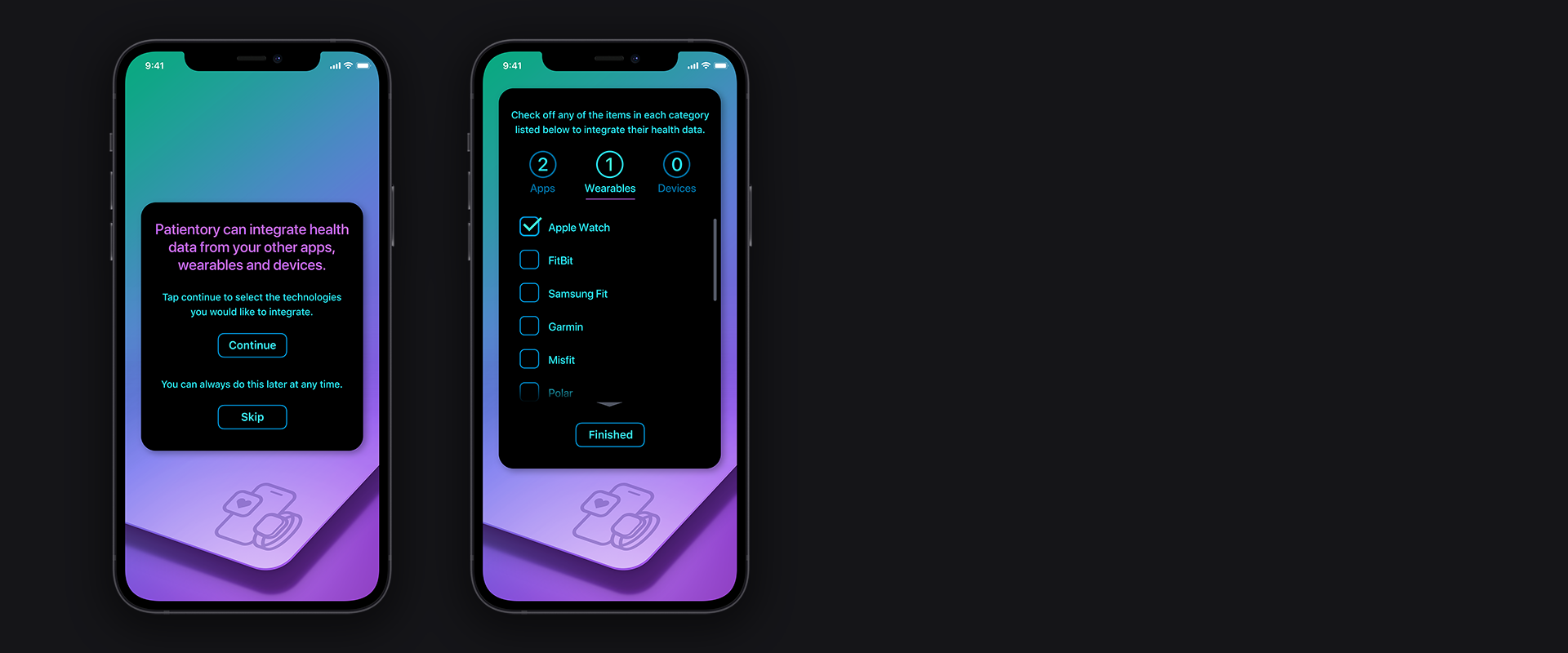
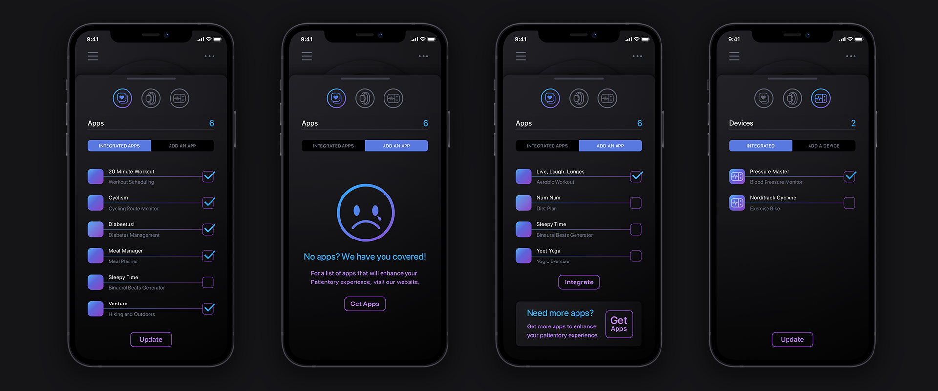
Integrating Apps + Devices + Wearables
There are more screens to view, but are redundant visually. Here’s a look at some of them.
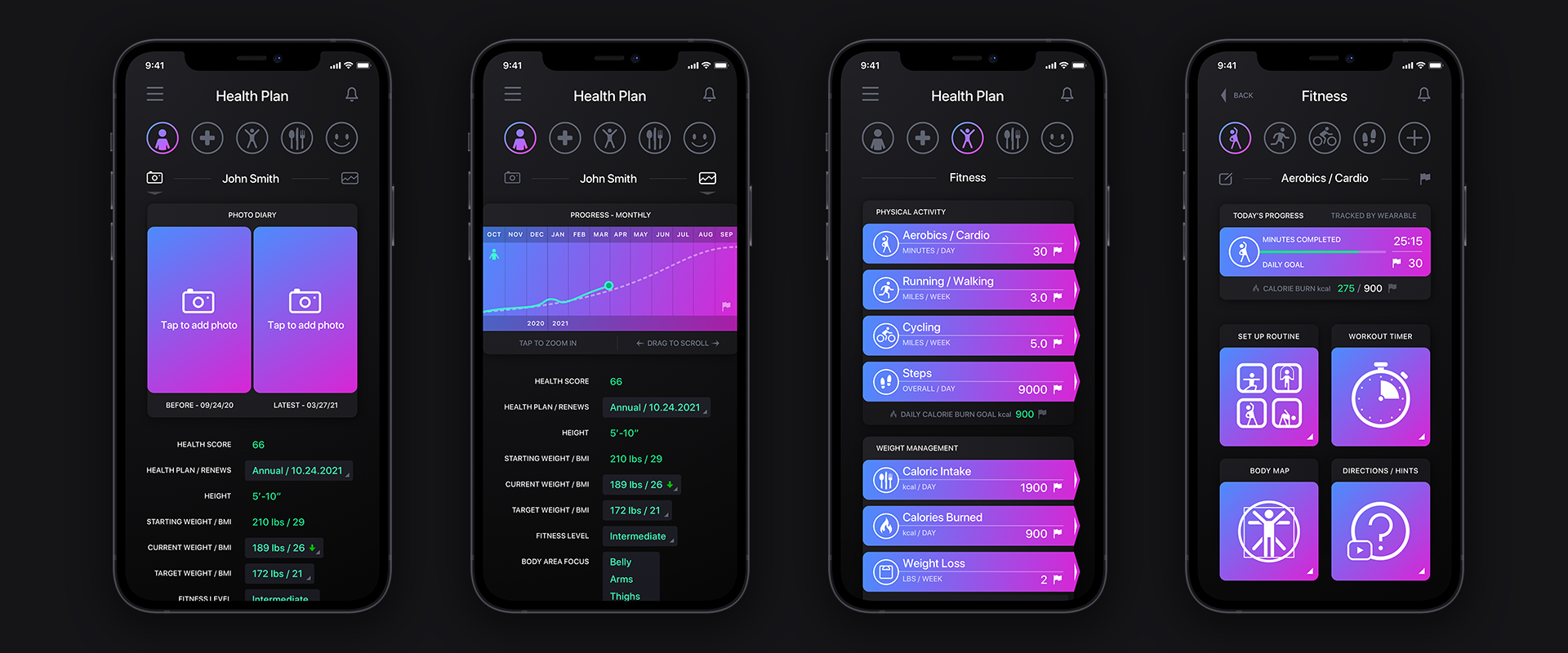
The Health Plan
A look at four of the many screens we designed for the Health Plan portion of the project.