
Brand Identity Design
Extraordinary Vision.
Whether your company requires our design specialists to conceive or re-conceptualize an existing brand, our team will work your executives or marketing team to develop and design a brand that will convey your company, service or product’s intent to the public in a refreshingly creative way. For logo design, we can create both print and web-ready logos including full collateral packages.
To our credit we’ve created product & company names for our clients, handled the design of the logo’s creation and created the collateral.
“During the creation & growth of Virtual Heroes Inc., we funded & provided detailed creative briefs to several brand designers who came highly recommended. The results we received however, did not hit the “wow” factor we were seeking. At a point where we were exhausted in this process and about to settle, we discovered The Skins Factory.”
Jerry Heneghan, CEO of Virtual Heroes, Inc.
Featured Project: AVASIS

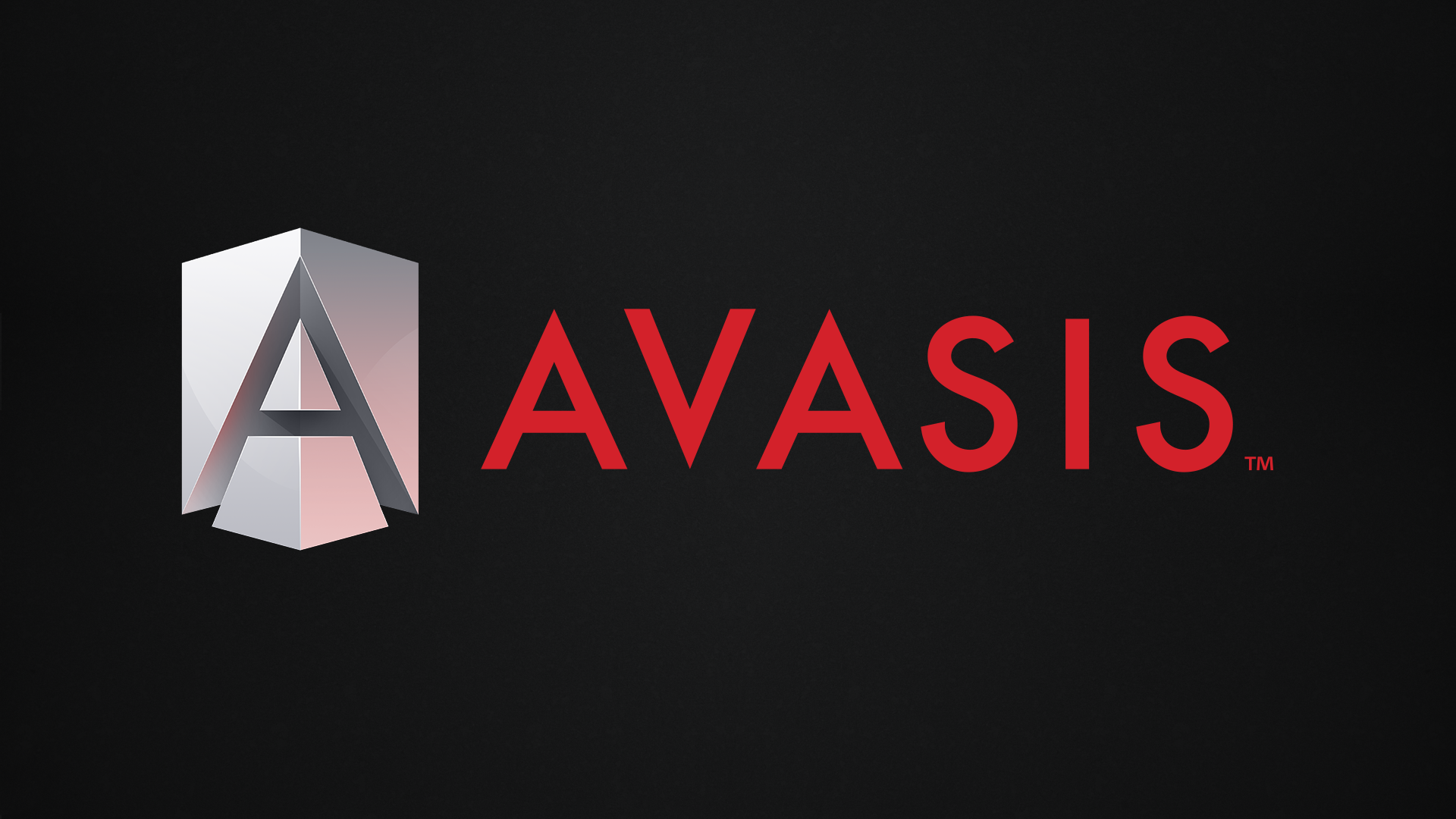
Horizontal Version

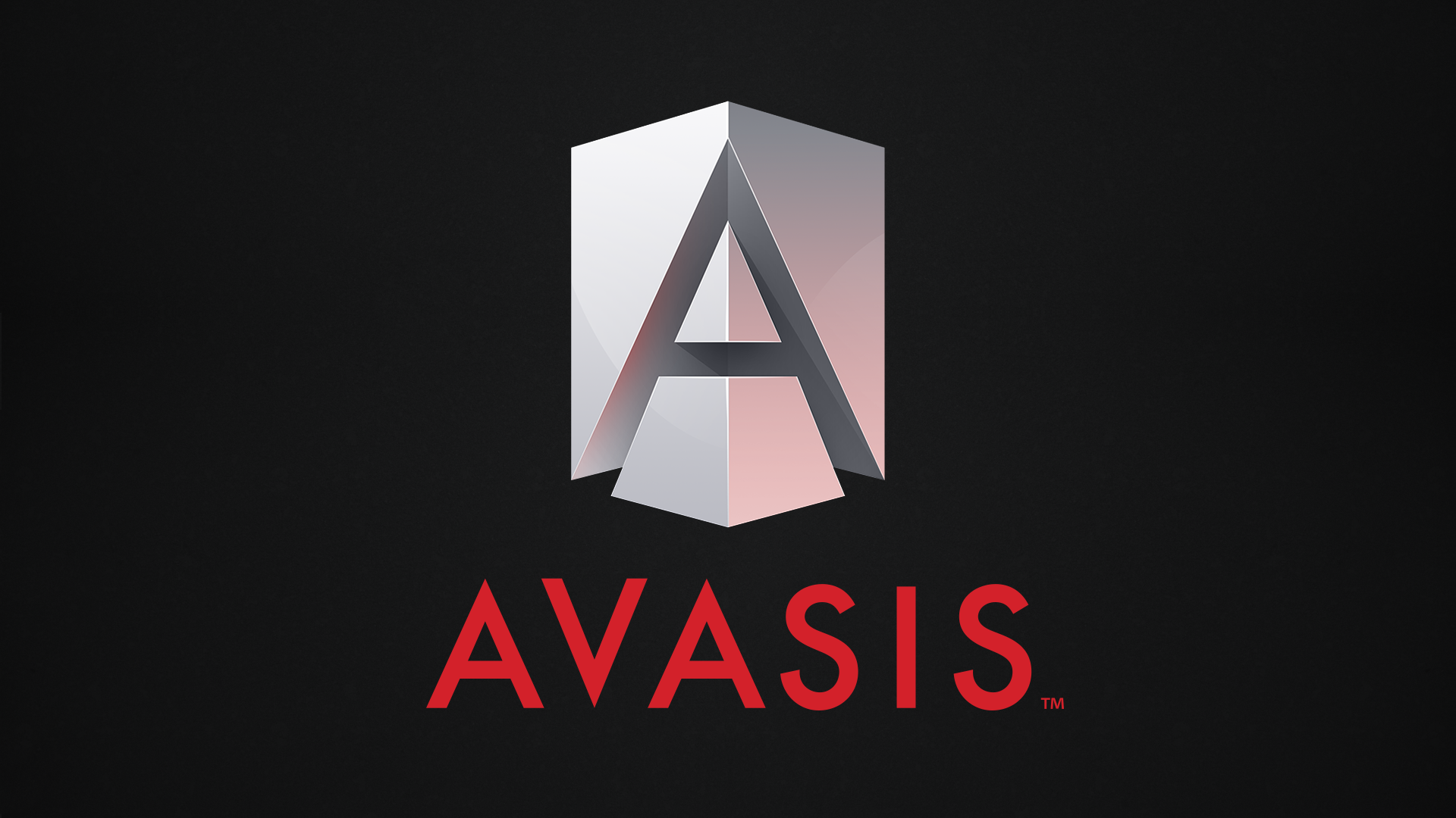
Stacked Version

AVASIS
Client: AVASIS
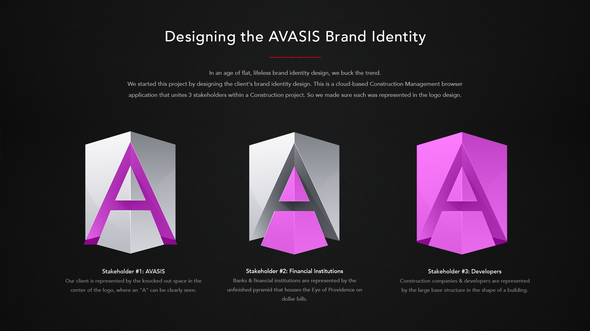
The AVASIS Construction Management software unites 3 stakeholders within 1 construction project. Each of the 3 main stakeholders are represented in the logo. Stakeholder #1: Construction companies. They're represented by the large base structure. Stakeholder #2: Banks. They're represented by the sliced pyramid in front. This is representative of the Eye of Providence pyramid on dollar bills. Stakeholder #3: AVASIS. They're represented by the knocked out space between the two, where an "A" can be clearly seen.

Playlist Music Player
Client: In-house
The brand identity for Skins Factory's iOS music player app for iPhone. Because colors & music both evoke a wide range of human emotions, we took a stylized "play" icon and infused it with a full spectrum of colors. This is symbolic of the symmetry that music and colors share, when it comes to their affect on our feelings when we're engaged with them. This chromatic design language was carried over into the UI of the player, as colors permeate the design and offer an emotional connection to the user.
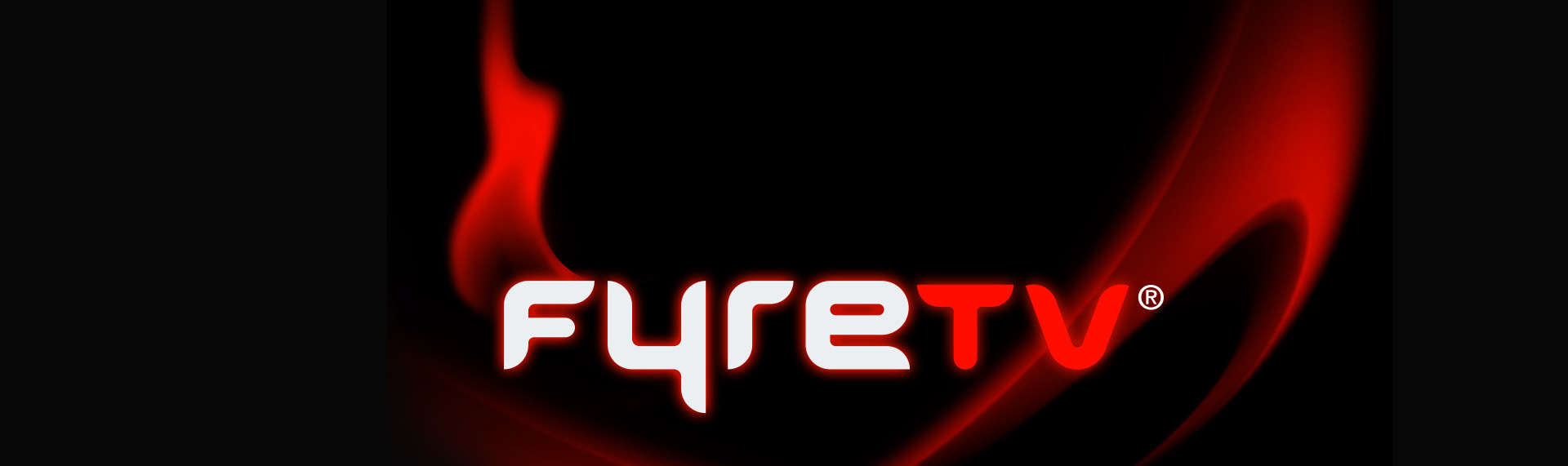
FyreTV
Client: Wreal, LLC
When Wreal first approached us, the working name for their service lacked "punch". We came up with a name that was not only a perfect fit, but one that actually had an available domain name - a considerable feat these days. The results was a catchy, easy to remember name, and a sure-fire hit with the target demographic. By utilizing a licking flame and precisely the right typeface, we created an identity that drove the look & feel of the entire user experience.
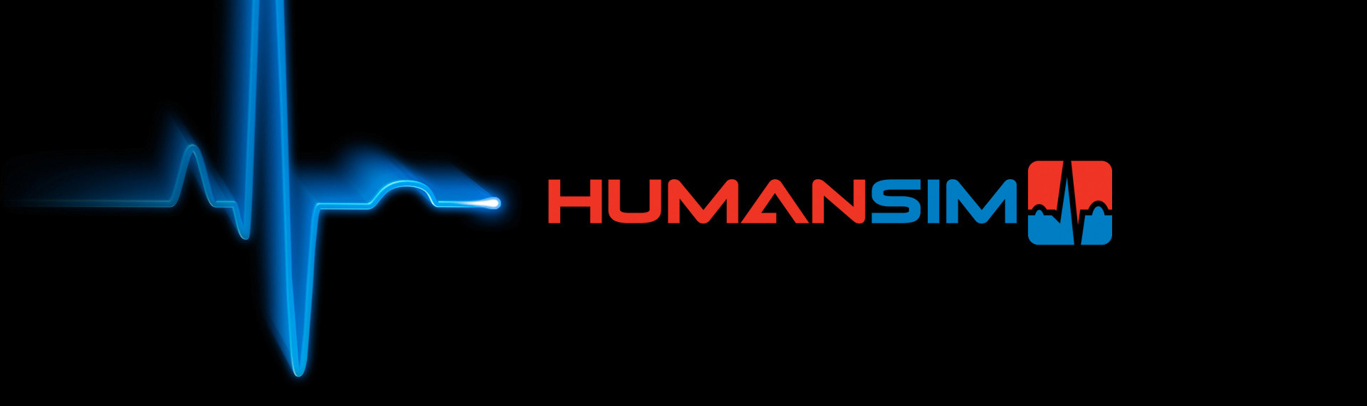
HumanSim
Client: Virtual Heroes
After the first successful brand identity creation endeavor for Virtual Heroes, the company came back to us a second time to design the logo for their HumanSim product. HumanSim by Virtual Heroes, enables health care professionals to sharpen their assessment and decision-making skills without risk to patients in realistic, challenging, immersive environments. HumanSim is part of their Advanced Learning Technologies leveraging simulation and digital games-based learning paradigms to accelerate learning.
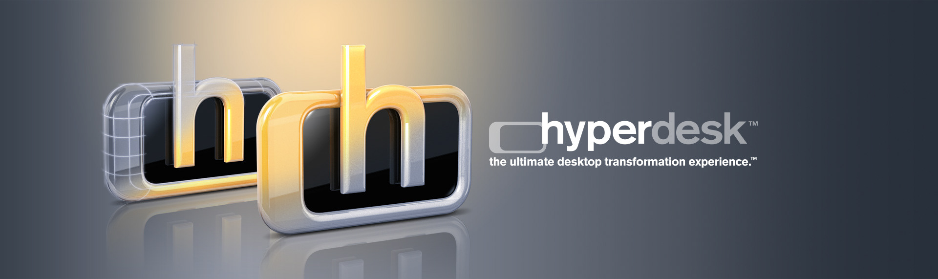
Hyperdesk
Client: In-house
The logo for our flagship Windows desktop theming product - Hyperdesk. We chose a clean, accessible font that would appeal not only to our consumer base, but to the technology and entertainment industry who has come to rely on Hyperdesk to bring their brand identity to the world's Windows desktop in the form of immersive, Windows desktop hypersuites. We fashioned two distinct logos, one for the product and one to be used as an desktop icon for the application.
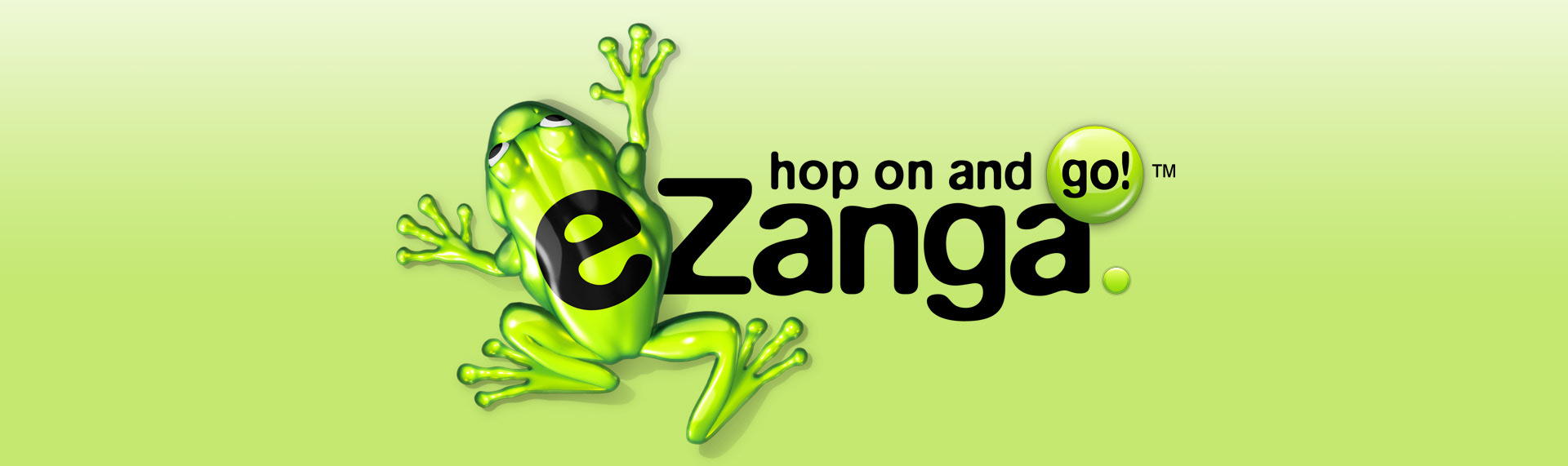
eZanga
Client: eZanga.com
When search/portal company eZanga.com approached us about giving their site & brand identity a complete overhaul, we jumped at the chance. Not only were they understandably excited about their impending metamorphosis, but we found ourselves equally as excited at the prospect of working with such potent brand potential. With a catchy name like eZanga & a frog mascot - the possibilities were endless. Through clever font execution & engaging, custom illustrations, eZangas new brand shines.
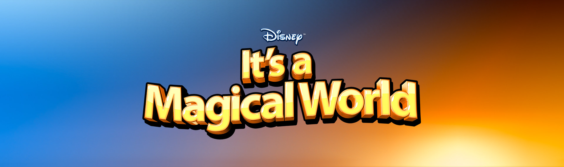
Disney's It's a Magical World
Client: The Skins Factory (Under License from The Walt Disney Company)
A brand identity we created for our Hyperdesk Windows desktop theme - the official Disney's It's a Magical World. As an official licensee (and long time vendor) of The Walt Disney Company, we brought the same dynamics to the style of the logo as we delivered to the desktop themes. The results are a logo that exemplifies the Disney brand - fun, bold and definitely magical.

Disney Desktop
Client: The Skins Factory (Under License from The Walt Disney Company)
An original concept name and logo we created for the official Disney Hyperdesk Windows themes. Harnessing the Disney magic we've all grown up with, the Disney Desktop would have delighted users of all ages with its playful, generously large letters, fairy dust and Tinker Bell. It was rejected by Disney for use of the name as a central part of the product title and the Tinker Bell character. The follow-up product name would end up being called: Disney's It's a Magical World.
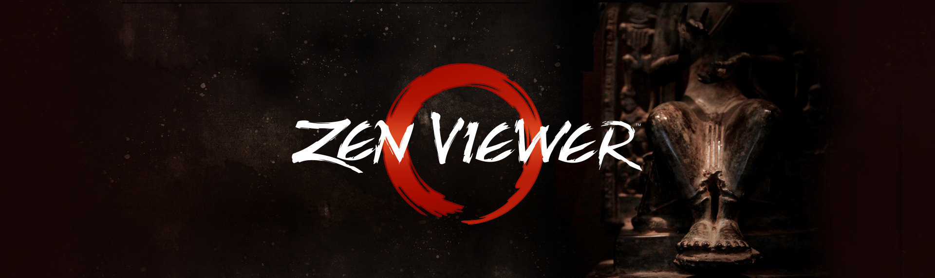
Zen Viewer
Client: In-house
Zen Viewer was a muiti-function file viewer that had a style unlike any of the other readers on the Apple App Store. While working on Zen Viewer, we felt strongly that the brand identity should reflect the app's intuitive experience. The Skins Factory is well-known for designing applications where form and function are in perfect harmony. For the Zen Viewer logo's symbol, we chose the Ensō symbol, which symbolizes enlightenment & elegance.
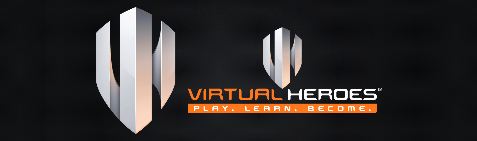
Virtual Heroes
Client: Virtual Heroes
The Skins Factory was brought in to re-conceptualize Virtual Heroes brand. Based on Virtual Heroes clientele, our team decided early on that the identity must portray a sense of strength while still conveying the fact that Virtual Heroes deals with virtual reality environments. The end-result is an identity that symbolizes strength through design and the feeling of virtual reality through shape & form.
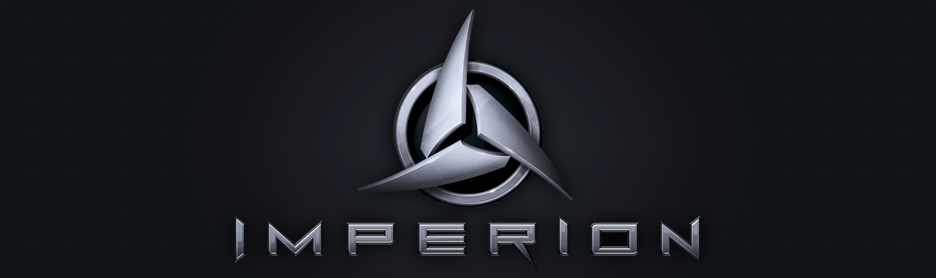
Imperion
Client: Travian Games
Travian Games contracted TSF to create the logo & online game user interface for their strategy game - Imperion. Our team focused on the dynamics of gameplay to steer the direction of the logo's design language. Imperion has three species fighting for domination over space. We created an iconic symbol of three blades influx to denote conflict that hover over a ring which symbolizes worlds. The deep alloy interior with sculpted bevel and sharp typeface carries over the danger & strength of the logo's symbol.
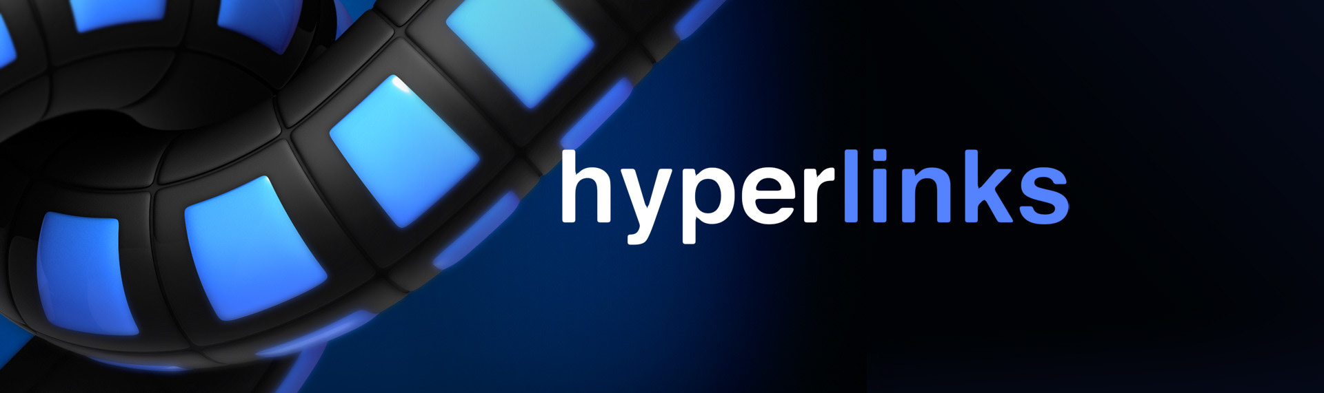
Hyperlinks
Client: In-house
The brand identity The Skins Factory created for our in-house iPad app: Hyperlinks. Hyperlinks for iPad is a bookmark and browser experience never before seen on any platform. Manage your bookmarks in categories, view your hyperlinks in multiple layouts, customize each bookmark, secure categories with passwords and even launch multiple web pages at the same time with the application's custom launchpad and browser. Proof of concept.
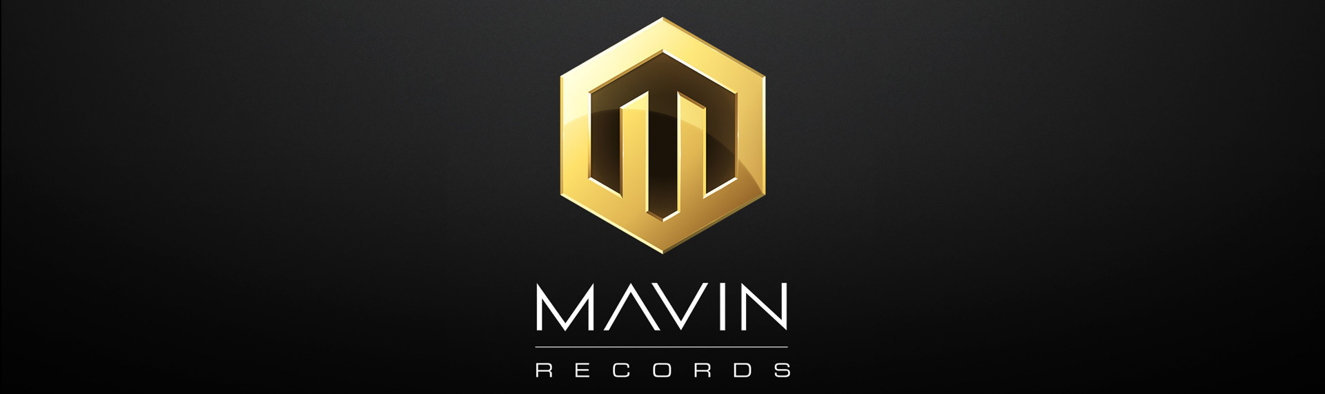
MAVIN Records
Client: MAVIN Records
Mavin Records is a Nigerian-based record label founded by recording artist and record producer Don Jazzy. They contracted The Skins Factory to design a new brand identity for their Lagos-based label. We designed the new symbol to be utilized on both web and print platforms in a faux gold design language. This would allow printers to use a gold foil when printing shirts, posters and swag that really makes the logo pop.
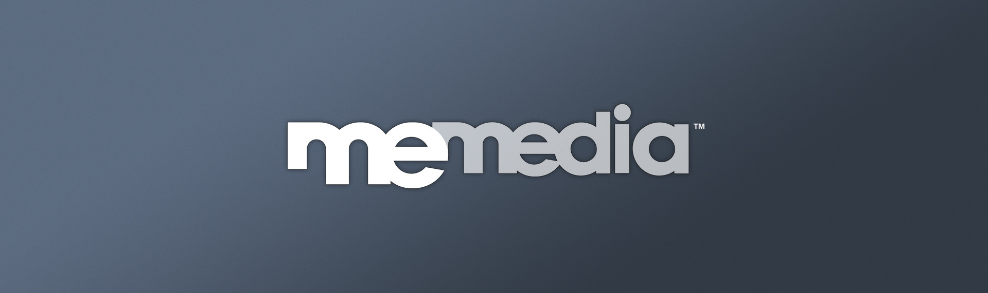
MeMedia
Client: MeMedia, Inc.
MeMedia, Inc. contracted The Skins Factory for a complete design suite which included the design & development of the user interface for their breakthrough application, MeMe and both their corporate and product name branding. Our creative team designed a pair of synergistic logos that not only feel connected, but deliver an appealing presence to both corporate users and consumers.
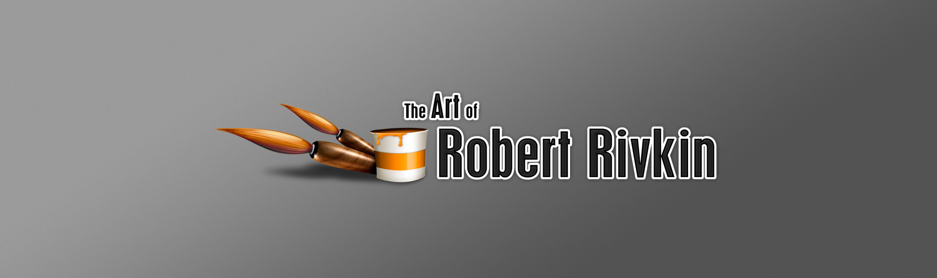
The Art of Robert Rivkin
Client: Robert Rivkin Studios
Award-winning artist Robert Rivkin selected our studio to create his brand identity as he steps into the online world. TSF carefully constructed an identity that would fly off his web pages & business cards and command the attention of everyone in view. We developed images that were rich in color, generous in depth and that would deliver a straight-forward message of who Mr. Rivkin is - a talented artist.
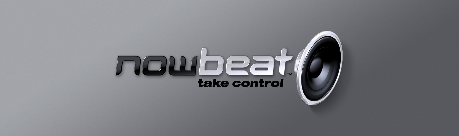
NowBeat
Client: FreeRevolution
The Skins Factory not only created the name of the product but also designed the logo & collateral package for this promising startup's main brand identity. Our Creative Team started by sourcing a suitable typeface which would provide a good visual basis for the conceptual identity we wished to convey - one with the undeniably youthful flare, bold presence and modern lines which which would bring the 'now' to NowBeat name.
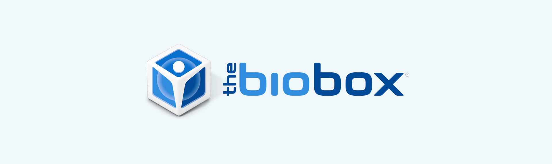
The BioBox
Client: DaVinci Biosciences
One of two product names, The Skins Factory created for DaVinci Biosciences. The BioBox offers consumers an opportunity to safely and securely store your stem cells, whether you expect to use them now or in the future. We derived the name from the product basic, core services, which are storage for your stem cells. We then designed a sleek box where a human's body makes up 3 corners of the box which holds a stem cell.